

I've noticed over the past months that most of my social sites have had a revamp in their layout and design (I guess we can thank the forthcoming of Web 2.0 for this). Most of them are a lot more sleek and aesthetic than their web counterparts, but some are chunkier and quite difficult to navigate, and others have completely changed (their content mainly). Below I've took the five main social sites in that I use and criticised/praised them on their changes, shown in chronological order.
1. Myspace
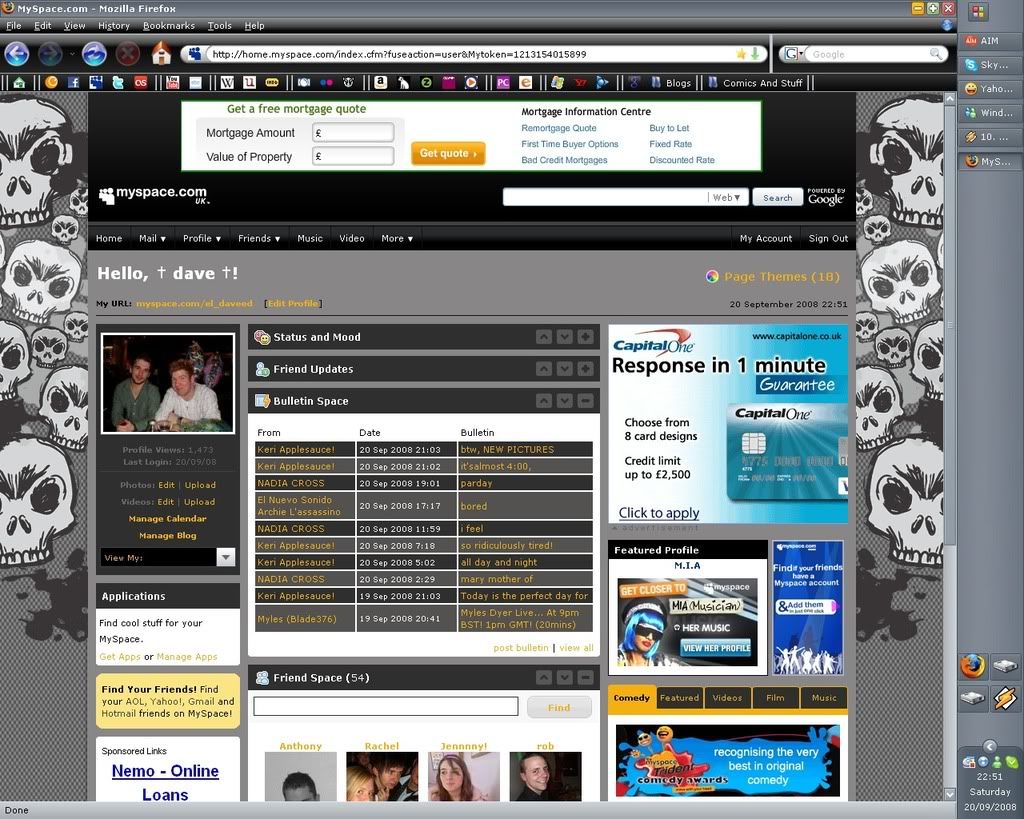
So Myspace was the first of these sites to change, and this happened sometime in late 2007, early 2008. Honestly, I can't remember the old Myspace layout all that well, but I do like what's happened with it. I love how you can reorder the boxes on your main page, and minimise them too. The multiple profile skins is a nice touch as well, giving you your own identity to even your home page. I can't really see anything negative about this at the moment, they even had the choice for you to switch back to the old layout at first (which has since disappeared). But it's a decent layout, and not too hard to navigate.
SCORE: 8/10
2. Last.Fm
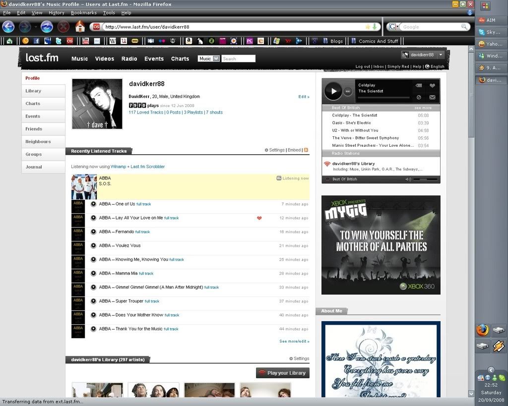
Last.fm followed suit in around July 2008. First off, they released the new version of the site as a beta, and only to selected users (I was one of these users). It's a good layout, but there are some down points. I'll address the positive points first though. A huge plus is the real time charts. The old charts only used to update every week, and sometimes wouldn't update until the Tuesday (even though the cutoff time was Sunday). With the real time charts it's easier to compare music with other people. It's also easier to keep track of all your play lists, etc. The negative points are the fact that there was NO option to revert back to the old layout which for some people was obviously devastating (judging by the number of groups labeled "Bring Back Old Last.fm"). Another annoying aspect was the fact that instead of the weekly charts, we now have the rolling seven-day chart. I LIKED THE WEEKLY CHART, some people can't see why, but it was just nice to see how your music taste changed from one week to the next.
SCORE: 7/10
3. Facebook
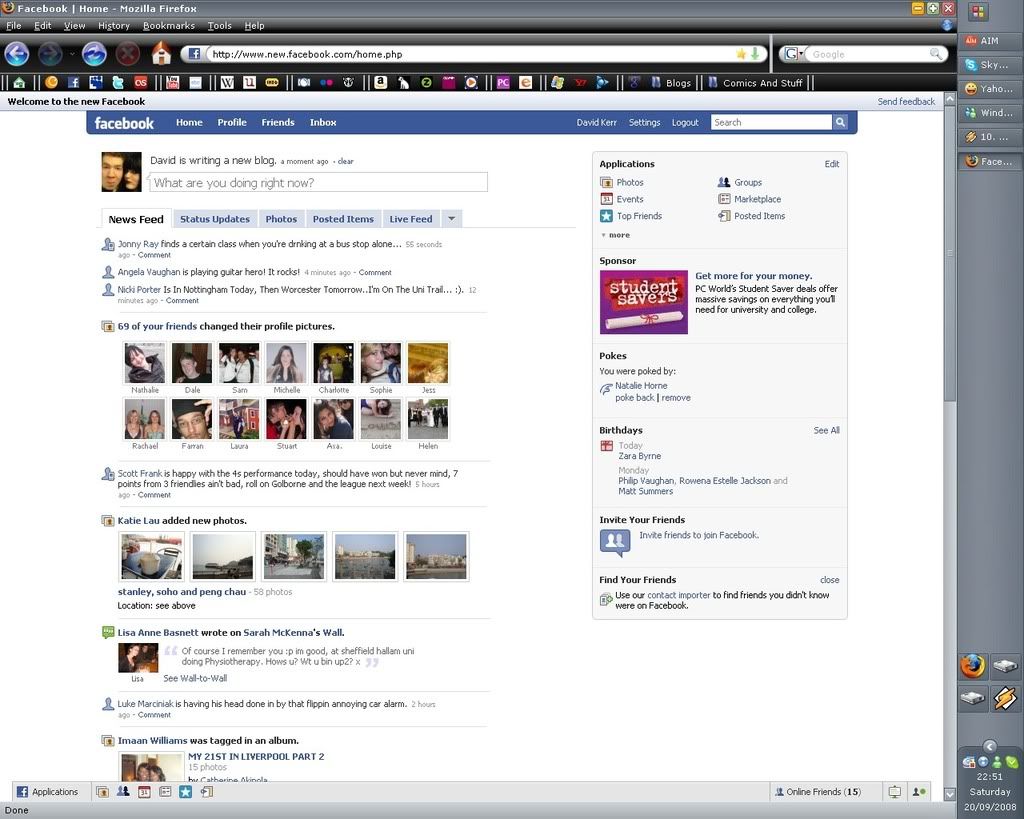
Facebook, well, they originally started the changeover sometime in May 2008, but only recently converted completely to the new version (a couple of weeks ago). There have been a LOT of complaints about this (many people's statuses have been "xxx hates the new Facebook"), although I can't see their problem. I've only encountered one dislike with it, and that's the fact that the default on a profile's wall is "all posts", it would be so much better if it was "posts by other people" (and I emailed Facebook and told them so). Overall though, it's much easier to navigate, there is no news feed now (well, there is, but it's in with the wall). A profile is much simpler now, and doesn't take as long to load because of the thousands of applications people have, these are all conveniently on the "boxes" tab. The newly added applications toolbar is a much applauded development, no matter where I am on the site now, I can with two clicks, go to any of my applications, bravo to the developers for that. Overall it's pretty streamlined, and I can't see why people are annoyed at the developers for the changeover.
SCORE: 9/10
4. Stickam
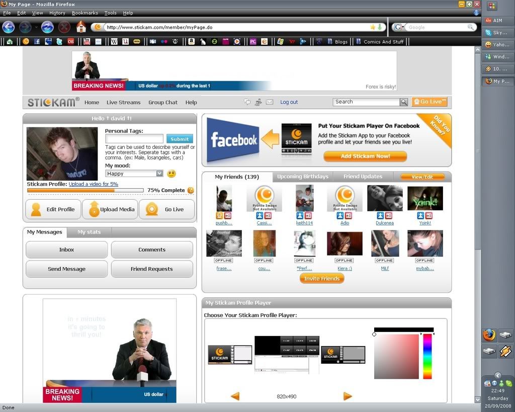
Okay, so Stickam seem to change their layout every couple of weeks, but this latest layout is just under a week old, AND I HATE IT! I can see why they replaced the previous navigation of separate sub-menus, it's easier to navigate to each part of the site from every single page now, but why did they have to change the little section with the live friends and new comments, etc. I've found that sometimes it doesn't even work, I liked knowing how many people I had live without having to click anywhere, it's now just more effort for me. It takes too long to load now, I could load Facebook around 10 times before Stickam loads, which to be honest if quite pathetic. But not to worry, they change it so much that it'll be a totally different layout in another couple of weeks, I just hope I can last that long with this layout.
SCORE: 3/10
5. Twitter
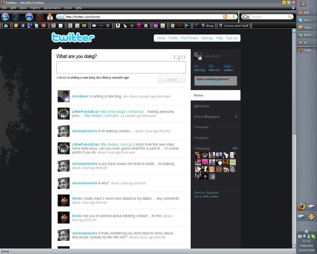
Finally, it's Twitter, who changed their layout on Thursday I believe. Overall, not much has changed. The navigation is now on the side instead of on the top, and the tweets are more spaced out, which I guess is easier for reading. It's also easier to find the @ replies (as there is a whole separate tab for them!) So even though it's only changed slightly, I'd say it's changed for the better. It now reloads the tweets without reloading the page, which is a lot faster than it was previously.
SCORE: 6/10
So, after the criticism of my most visited social sites, it's easy to see that the clear winner for me is Facebook (although millions of Internet users will disagree). Overall, the updates are well thought out, with just a few minor glitches, so I say roll on Web 2.0. You're much sleeker and nicer than the original Web.
That's enough of my ramblings now, lol.
Ciao. x
CURRENTLY LISTENING TO: Flux - Bloc Party
1. Myspace
So Myspace was the first of these sites to change, and this happened sometime in late 2007, early 2008. Honestly, I can't remember the old Myspace layout all that well, but I do like what's happened with it. I love how you can reorder the boxes on your main page, and minimise them too. The multiple profile skins is a nice touch as well, giving you your own identity to even your home page. I can't really see anything negative about this at the moment, they even had the choice for you to switch back to the old layout at first (which has since disappeared). But it's a decent layout, and not too hard to navigate.
SCORE: 8/10
2. Last.Fm
Last.fm followed suit in around July 2008. First off, they released the new version of the site as a beta, and only to selected users (I was one of these users). It's a good layout, but there are some down points. I'll address the positive points first though. A huge plus is the real time charts. The old charts only used to update every week, and sometimes wouldn't update until the Tuesday (even though the cutoff time was Sunday). With the real time charts it's easier to compare music with other people. It's also easier to keep track of all your play lists, etc. The negative points are the fact that there was NO option to revert back to the old layout which for some people was obviously devastating (judging by the number of groups labeled "Bring Back Old Last.fm"). Another annoying aspect was the fact that instead of the weekly charts, we now have the rolling seven-day chart. I LIKED THE WEEKLY CHART, some people can't see why, but it was just nice to see how your music taste changed from one week to the next.
SCORE: 7/10
3. Facebook
Facebook, well, they originally started the changeover sometime in May 2008, but only recently converted completely to the new version (a couple of weeks ago). There have been a LOT of complaints about this (many people's statuses have been "xxx hates the new Facebook"), although I can't see their problem. I've only encountered one dislike with it, and that's the fact that the default on a profile's wall is "all posts", it would be so much better if it was "posts by other people" (and I emailed Facebook and told them so). Overall though, it's much easier to navigate, there is no news feed now (well, there is, but it's in with the wall). A profile is much simpler now, and doesn't take as long to load because of the thousands of applications people have, these are all conveniently on the "boxes" tab. The newly added applications toolbar is a much applauded development, no matter where I am on the site now, I can with two clicks, go to any of my applications, bravo to the developers for that. Overall it's pretty streamlined, and I can't see why people are annoyed at the developers for the changeover.
SCORE: 9/10
4. Stickam
Okay, so Stickam seem to change their layout every couple of weeks, but this latest layout is just under a week old, AND I HATE IT! I can see why they replaced the previous navigation of separate sub-menus, it's easier to navigate to each part of the site from every single page now, but why did they have to change the little section with the live friends and new comments, etc. I've found that sometimes it doesn't even work, I liked knowing how many people I had live without having to click anywhere, it's now just more effort for me. It takes too long to load now, I could load Facebook around 10 times before Stickam loads, which to be honest if quite pathetic. But not to worry, they change it so much that it'll be a totally different layout in another couple of weeks, I just hope I can last that long with this layout.
SCORE: 3/10
5. Twitter
Finally, it's Twitter, who changed their layout on Thursday I believe. Overall, not much has changed. The navigation is now on the side instead of on the top, and the tweets are more spaced out, which I guess is easier for reading. It's also easier to find the @ replies (as there is a whole separate tab for them!) So even though it's only changed slightly, I'd say it's changed for the better. It now reloads the tweets without reloading the page, which is a lot faster than it was previously.
SCORE: 6/10
So, after the criticism of my most visited social sites, it's easy to see that the clear winner for me is Facebook (although millions of Internet users will disagree). Overall, the updates are well thought out, with just a few minor glitches, so I say roll on Web 2.0. You're much sleeker and nicer than the original Web.
That's enough of my ramblings now, lol.
Ciao. x
CURRENTLY LISTENING TO: Flux - Bloc Party

2 comments:
I like the way Myspace and Facebook have changed. And I like Stickam too. I don't understand why everyone is hating on Facebook. I like the new layout. I like the backgrounds for your home page on Myspace..and mister, why haven't I got you on Myspace? D:<
I agree wholeheartedly regarding Facebook. I don't have a problem with Twitter's recent make over, although I still habitually look for the replies tab underneath the text box and not in the sidebar where it now resides.
Post a Comment